UK Update
I have seen a particular style of production graph in only a few places, usually referencing natural gas. Jerome via TOD brought it to my attention again:

This plot shows the decline of individual fields on top of the overall production curve, which essentially provides a compact and instructive look at trends.
I asked a follow-up question at TOD referring to the possibility of similarly plotted graphs for oil fields. Sure enough, another commenter pointed out a UK study (PDF) which contained that kind of plot for North Sea oil. Apparently, the UK requires very detailed reporting of yearly production so the plot comes out quite clearly (click below for expanded view).

But another commenter pointed out that this data only extended to the year 2000, with only an extrapolation given for the ensuing years. So I offered up data to extend the profile to 2005.

Stepback then craftily combined the two sets of data, and voila:
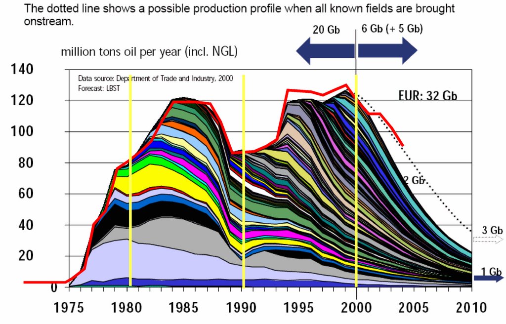
The red line indicates the updated data trend (corresponding to the yellow dots). Click to expand.
posted by @whut at March 26, 2006
![]()
![]()


3 Comments:
Amazing graphs! the second peak seems to be a sum of relatively little fields compared to the first peak. I dream to have that kind of detail on Saudi Arabia!
Aren't most of the undiscovered polar finds considered to be mainly natural gas?
Errr - how would you know what you'll find in undiscovered fields ?
Especially ones presently deep under ice caps ?
Post a Comment
<< Home